ECHO ATLAS / BRAND EDITION 01
A clearer way forward.
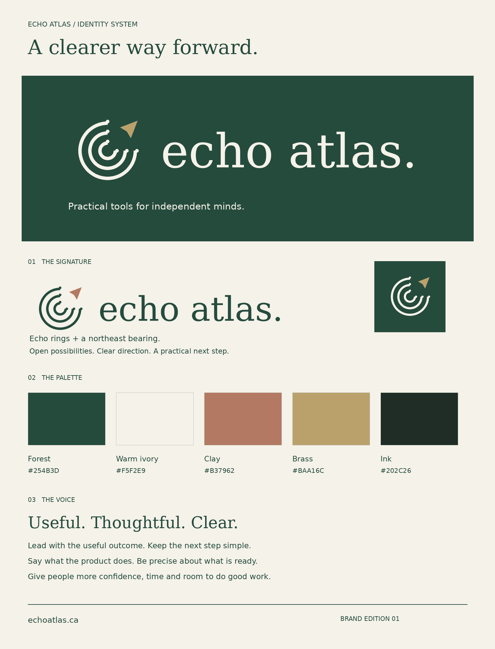
A calm, capable identity for practical tools, thoughtful processes and independent work. The Echo Meridian symbol pairs open echo rings with a northeast bearing: useful ideas, carried forward.

Practical tools for independent minds.
01 / Signature system
One identity. Room to move.
Primary signature

Reversed signature
Single-colour black
Single-colour white

02 / Colour
Grounded, with a little warmth.
Use Forest and Ink for body text on Warm ivory. Clay and Brass are accents; keep them to marks, rules and large decorative elements. Use the reversed logo on dark backgrounds.
03 / Typography
Editorial warmth. Everyday clarity.
Logo: custom-spaced DejaVu Serif Regular, converted to vector outlines. The supplied SVGs need no font installation.
Website headings: Georgia, with a serif fallback. Body and interface: system sans-serif. Use sentence case, generous spacing and short, direct labels.
04 / Use
Give the mark some breathing room.
Keep clear space at least one quarter of the symbol’s width on every side. Minimum digital width: 160 px for the full signature; 24 px for the mark. Use the ICO for tiny browser icons.
Keep original proportions and supplied colours. Avoid stretching, adding shadows, enclosing the mark in extra shapes or putting detailed backgrounds behind it. Use one-colour artwork for engraving or one-ink printing.
05 / Voice
Useful. Thoughtful. Clear.
Lead with the useful outcome. Explain what someone can do next. Be specific about what a product includes and what is ready. Write with calm confidence, without hype or income guarantees.
Core line: Practical tools for independent minds.
Supporting line: A clearer way forward.
Example: “Keep the details together. Make the next step easier.”
06 / Overview